Universe
Typeface
Experimental
Type Design
WIP
Universe is a typeface and utopian exercise for reimagining hierarchies within the Latin alphabet. It explores text-based applications for the unicase model through alternate expressions of hierarchy and drawings that maximize legibility.
WORK IN PROGRESS
WORK IN PROGRESS
2019-Present
1 Standard Weight / 1 Heavy Weight in Development


Universe started as a redrawing of Folio. As a phototype from the 1950s-80s, Folio included a small selection of alternate characters that would allow for it to be used as a unicase, or an alphabet with a single case of letters. Current digital drawings of Folio do not include these characters, so I sought to create a true unicase version of Folio for personal use.
The original alternate characters were no more than proportionally-enlarged lowercase letters that looked out of place when typeset at the same height as the capitals. (Maybe those characters were unpopular among typesetters and that’s why there are few examples of the unicase in use.) In my redrawing of the typeface, I tried to correct for discrepancies in weight and form between the lowercase and capital characters to create a more unified and even look.
The original alternate characters were no more than proportionally-enlarged lowercase letters that looked out of place when typeset at the same height as the capitals. (Maybe those characters were unpopular among typesetters and that’s why there are few examples of the unicase in use.) In my redrawing of the typeface, I tried to correct for discrepancies in weight and form between the lowercase and capital characters to create a more unified and even look.

Above
Universe character set, including alternate “emphasis” characters.
Below
Jazz album cover references for Universe. “Cosmic Music” on the left features a unicase application of Helvetica, while “Quiet Nights” on the right features Folio typeset with alternate unicase characters.
![]()
![]()
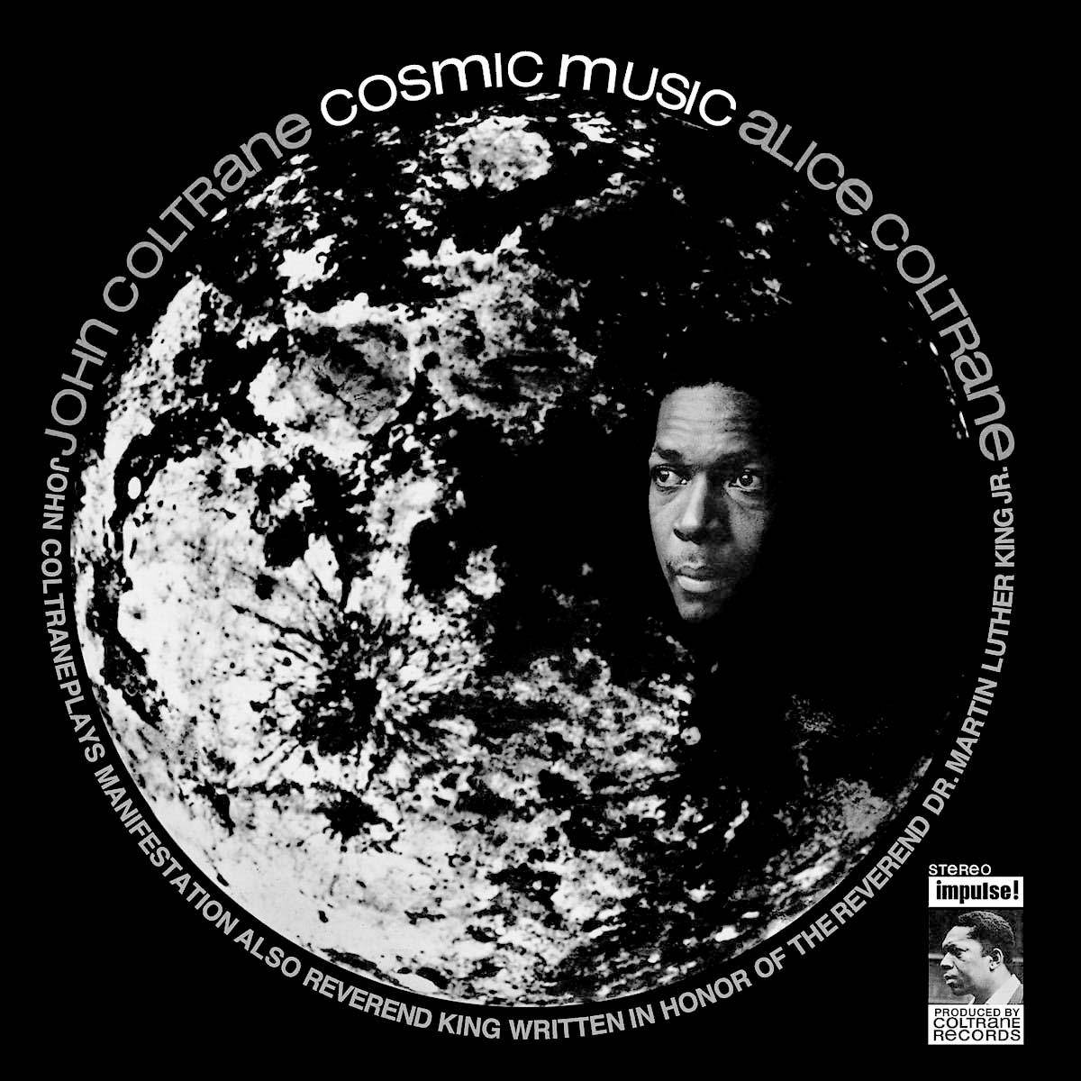

In my research, I came across several examples of Folio unicase and similar sans serif type treatments on jazz album covers from the 1960s and 70s.
It seems fitting for a unicase to accompany the boundary-pushing works of John Coltrane, Alice Coltrane and Miles Davis, for example. But there is also something utopian about seeing a unicase within this context. Their proximity to experimental jazz gives the unicase the look of a reinvented language from the future that has done away with antiquated hierarchies embedded within the Latin alphabet. I had not considered the unicase’s potential to reinvent our relationship to the English language prior to this revelation.
With that idea in mind, I drew a series of alternate characters that could be used interchangably with the primary character set. These alternates are intended to add “emphasis” at the beginning of a paragraph or sentence to provide a sense of structure for clarity of communication without necessarily implying a sense of hierarchy.


Above
Typesetting tests in various display and text applications.
The “emphasis” characters are most useful for typesetting text. Universe also includes a selection of ligatures that facilitate typesetting at display scales and creating lockups.
In addition to building out the character set and refining letterspacing, I am also drawing a heavier weight of Universe, which made an appearance in the text compositions of the mixedgreens How to Marble* publication.
In addition to building out the character set and refining letterspacing, I am also drawing a heavier weight of Universe, which made an appearance in the text compositions of the mixedgreens How to Marble* publication.